言葉・形・動きの一貫性
ブランド
この領域の18件の標準モジュールを、要点を編集した概要と一つの原典全文で紹介します。
ブランド契約
ひとつの人格を、あなたに求めるのと同じ方法で証明する。
このページは二言語で編集しています。ブランド契約・人格・CMY文法は英語と日本語のどちらでも自然に読めます。翻訳されるまで原典の英語を保つのは、下部の詳細モジュールだけです。
- 目的
- デザインの美意識を証明可能にすること。進化し続ける体系、セマンティックトークン、アクセシブルなコンポーネント、モーション契約を、すべて一次情報まで辿れるようにします。
- トーン
- 遊び心のある精密さ。教えるほど編集的で、覚えられるほど大胆。白い紙、CMYのエネルギー、濃いインク。
- 制約
- 白い読み面と濃い文字。CMYロゴマークと設計されたスペクトラム。セマンティックトークンのみ。WCAG 2.2 AA、可視フォーカス、完全なキーボード操作、動きの削減を尊重。日本語ファーストの文字組み。
- 差別化
- 根拠を伴う美意識。鮮度を追跡するReference Atlas、検証可能な根拠グラフ、そしてドキュメントそのものとして動くコンポーネント。
人格
ひとつの人格を、計器のように正直に。
AwesomeDSは、机の上に出典を開いたまま仕事をする主席デザイナーのように振る舞います。そして、たとえ結果が「要確認」であっても、正直な計測値を報告する実験室の計器のように。
- 動詞で表す性格
- 計測する
- 明快にする
- 証明する
- 構成する
- 抑制する
- 感情の幅
- 静かな自信、そして精密さ。ときに等幅の余白で控えめな皮肉を。決して声高にはなりません。
- ボイスの質
- 精密
- 出典つき
- 平明
- 急がない
- 決してならないもの
- 誇張だらけのピッチデッキ
- ルールのないムードボード
- 「AIスロップ」なグラデーション量産機
- ロゴの壁
図で示す文法
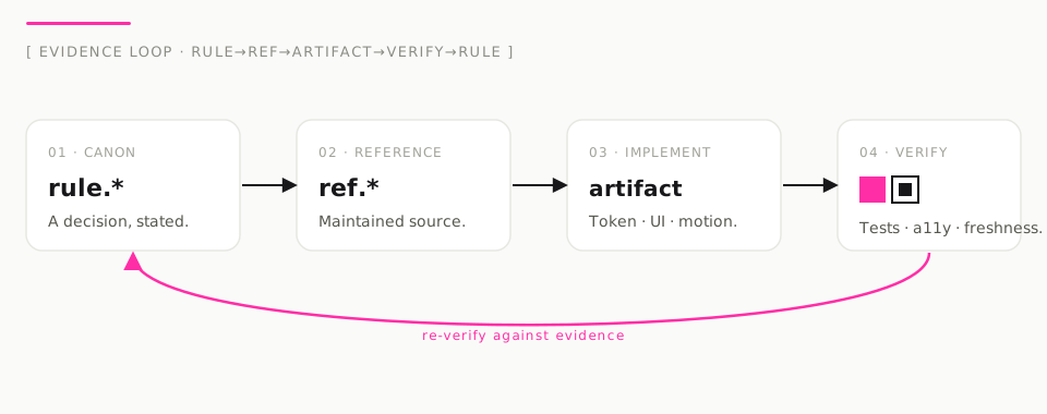
- 01 · 体系
rule.*言葉にした、ひとつの判断。 - 02 · 情報源
ref.*その判断が拠って立つ一次情報。 - 03 · 実装
トークン · 部品 · モーション実行可能な成果物。 - 04 · 検証
proofテスト・アクセシビリティ・鮮度に照らして確認。
検証から体系へ、エンバーの帰り道が一本だけ弧を描く。すべてのルールは根拠に対して繰り返し確認されます。
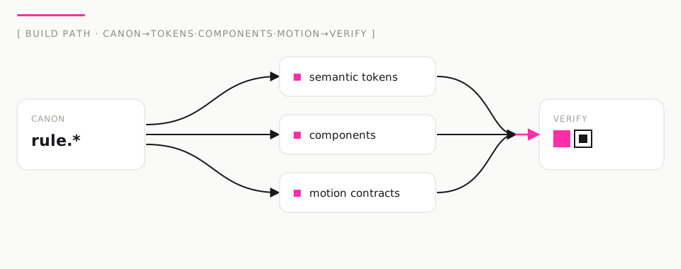
- 01 · 体系
rule.*ひとつの判断。 - 02 · 構築
トークン · 部品 · モーション範囲を定めた、実行可能な成果物の集合。 - 03 · 検証
proof状態・アクセシビリティ・根拠・鮮度を確認してから出荷。
枝分かれの矢印はインク。検証へ収束する矢印だけが、単一のエンバー信号です。
注目: AwesomeDS — Brand Design System (the bible)
下部のブランドモジュール全文は、原典である英語から表示しています。
AwesomeDS — Brand Design System
This is AwesomeDS's own brand, defined with the same rigor the platform demands of every product it helps build. It is the single source of truth for how AwesomeDS looks, sounds, and behaves across the site, README imagery,
assets/banner.svg, OG images, diagrams, tokens, components, motion, copy, and the distributed skills. Load this before any brand-facing work, alongsidecross-medium-coherence.md.
We studied three elite systems and sublimated — did not imitate — them:
- matrix.build → narrative sequencing and the courage to be an experiment with a thesis.
- Duolingo → one declared personality that survives intact into words, shape, color, and motion.
- Nothing Technology → industrial typographic confidence, a visible grid, and playful precision.
None of their assets, palettes, or marks are reused. What we take is method, expressed as AwesomeDS's own evidence-first · agent-readable · Japanese-first identity.
1. Brand contract (Purpose · Tone · Constraints · Differentiation)
Purpose. Make design taste provable. AwesomeDS turns first-party design knowledge into a living Canon, semantic tokens, accessible components, motion contracts, and instructions that both people and AI agents can verify — so a good decision can always be traced to a source.
Tone. Playful precision. Editorial enough to teach, bold enough to remember — like matrix.build's narrative courage, Nothing's industrial restraint, and Duolingo's one personality across media. White paper, CMY energy, dark ink. Never sterile, never hype-slop, never a logo wall.
Constraints (non-negotiable).
- White reading surface, dark ink. Never a dark hero. A dark panel may appear as one isolated,
content-bounded data plane; it is deliberate, never the page. Light-first is the contract;
data-theme="dark"is an opt-in accommodation, not a second identity. - CMY logomark (cyan · magenta · yellow) + designed OKLCH spectrum as brand decoration.
Interactive chrome uses a deep magenta
--color-accent(AA on white). Status colors carry only status. - Semantic tokens only; no raw hex/oklch in product UI (brand assets and the docs brand layer are the exception).
- WCAG 2.2 AA, visible
:focus-visible, full keyboard paths,prefers-reduced-motionhonored. - Japanese-first typography is a first-class citizen, not a translation afterthought.
- Every doctrine claim links to maintained evidence (
rule.* → ref.*). No unsourced authority.
Differentiation. Design references usually sell aesthetics. AwesomeDS ships aesthetics with
receipts: a freshness-tracked Reference Atlas, an evidence graph you can validate (pnpm validate),
executable components as the documentation, and a contract compact enough for an agent to obey.
The signature is the CMY mark + spectrum: taste you can open, run, and verify — with a little joy.
2. Personality
| Traits (3–5 verbs) | measures, clarifies, proves, composes, restrains |
| Emotional range | quietly assured → precise → occasionally wry (in mono asides), never loud |
| Anti-personas | the hype deck, the mood-board with no rules, the "AI slop" gradient-blob generator, the logo wall |
AwesomeDS behaves like a principal designer who keeps their sources open on the desk — and a laboratory instrument that reports honest readings even when the reading is "needs review".
3. Signature visual grammar
The grammar is what makes an AwesomeDS surface recognizable in one glance, independent of content.
It is implemented in apps/docs/app/globals.css, assets/banner.svg, and app/opengraph-image.tsx.
3.1 The CMY logomark (primary signature)
Three overlapping circles — cyan #15C7DE · magenta #FF2EA6 · yellow #FFD400 — in
subtractive mixing (mix-blend-mode: multiply). The 🎨 metaphor, drawn. It is the brand's
primary signature on the site header, README banner, OG image, and app icon.
One geometry, three surfaces. Ratios live in apps/docs/lib/cmy-mark.ts. The site renders
<CmyMark>, OG uses computeCmyMark, and assets/banner.svg hand-authors the same cluster.
apps/docs/tests/cmy-mark-geometry.test.ts locks the contract so the mark cannot silently drift.
A calm "breathe" motion is decorative only and halts under prefers-reduced-motion.
3.2 The OKLCH spectrum
An 8-stop hue-stepped spectrum (same lightness/chroma, designed — not a random rainbow) as the signature underline and footer stripe. It appears on the banner, OG, and hero accent chips.
3.3 Soft CMY field
Faint cyan / magenta / yellow radial washes plus a hairline dot grid behind the LP hero — energy without darkening the reading surface.
3.4 Registration labels
Monospace, uppercase, letter-spaced indices (01 · COLOR, CANON → BUILD → VERIFY). Coordinates
over adjectives. This is the Nothing lesson in our vocabulary.
3.5 Character (Dotto)
An original CMY mascot used on the LP and motion demos. Playful motion that still honors reduced motion. Never third-party IP (no Duo assets).
3.6 Type pairing
- Display / editorial: Newsreader (serif) — the publication voice; big, tight,
text-wrap: balance. - UI / body: IBM Plex Sans — precise, neutral, engineered.
- Mono / labels: IBM Plex Mono — the instrument's readout.
- Japanese: Platform native Japanese UI faces with their own leading, tracking, and line-breaking. Latin-centric bans (em-dash/curly-quote rules) relax under JP.
The generated Open Graph image uses Georgia/Arial as an explicit Satori rendering fallback. Variable Newsreader/Plex webfonts remain canonical for browser and SVG surfaces; OG preserves their editorial/UI role contrast, spacing, proof mark, grid, and ember signal without adding duplicate font payloads.
3.6 Color signal — the ember
| Role | Light | Meaning |
|---|---|---|
--color-accent |
oklch(0.522 0.166 43) |
the single interaction + proof signal (AA 5.9:1 on white) |
--color-accent (dark) |
oklch(0.735 0.160 48) |
ember glows on the bounded dark plane |
| status | success/warning/danger | only status — never borrowed for emphasis |
The former purple (hue 264) was retired: it violated the system's own "no purple-on-white" non-negotiable and read as generic. Ember is authored, warm, and legible as "signal / verified".
3.7 Color signal — interaction accent
The CMY mark is the identity. Interactive chrome uses deep magenta
--color-accent: oklch(0.50 0.22 350) (docs brand layer) so UI chrome meets WCAG 2.2 AA on white.
Yellow and cyan decorate; they are not body text colors.
3.8 Misuse (forbidden)
- ✗ Random multi-hue decoration that is not the designed OKLCH spectrum.
- ✗ Magenta/cyan/yellow as large full-bleed backgrounds that kill contrast.
- ✗ Dark full-page hero, white-on-black reading surfaces.
- ✗ Decorative field over text (washes and grids stay behind, always faded).
- ✗ Registration labels used as body copy.
- ✗ Retired ember proof-mark geometry (
#C0472Asquares) on any AwesomeDS surface.
4. Voice & tone
Voice qualities (always true): precise, sourced, plain, unhurried. We name the rule, show the example, cite the evidence, and stop. We prefer verbs to adjectives and readings to claims.
Tone matrix (context-dependent):
| Context | Tone | Example |
|---|---|---|
| Marketing / hero | assured, editorial | "Taste you can prove." |
| Onboarding | guiding, concrete | "Read the Canon to decide. Compose to build. Trace to prove." |
| Success | quiet confirmation | "Evidence connected — this pattern cites canonical rules." |
| Empty | orienting, no dead end | "No sources yet. Add one to content/references/ to begin the trail." |
| Error / needs-review | honest, actionable | "Evidence graph needs review — 2 rules lack a linked source." |
| Agent instruction | imperative, compact | "Read DESIGN.md → cite rule.* → compose @awesome-ds/react → verify states + a11y + evidence." |
Verbal character — who speaks: a principal designer who keeps sources open — with Dotto as optional joy on marketing surfaces, never as the voice of doctrine. We never say "revolutionary", "magic", or "effortless", and never claim authority without a citation.
5. Motion personality
MOTION_INTENSITY 6/10. Movement is purposeful play, not decoration spam.
- One orchestrated entrance per page load; then stillness. (
ads-motion-enter.) - CMY orbs may breathe slowly (≥5s); Dotto may bob/wave; both halt under reduced motion.
- Enter/feedback/reveal recipes are purpose-declared (
@awesome-ds/motion); each states where it does not belong and its reduced-motion replacement. prefers-reduced-motion: reduce→ all decorative motion halts; state changes remain instant.- Animate
transform/opacityonly. Nevertransition: all. - One controlled surprise (functional, not confetti). The Proof Calibrator's verdict "acquires
the target": on each intent selection the ember registers onto the target square as a completion
cue that the evidence trace fully resolved (
source → rule → artifact → verdict). It is feedback, not ornament — it fires only on a real state change, carries the verdict as its accessible label, halts underprefers-reduced-motion(shown pre-registered), and maps to system colors underforced-colors. Playfulness lives inside the instrument metaphor; it never becomes a mascot.
5A. Proof-grammar diagrams (reusable explainers)
Two canonical diagrams state the method as a picture. They are authored once as static SVGs so the site and the README render the exact same file — no redraw, no drift:
assets/diagram-evidence-loop.svg— the evidence loop:rule.* → ref.* → artifact → verify, with a single ember return path closing the loop (every rule is re-checked against its evidence).assets/diagram-canon-to-verify.svg— the build path:Canon → tokens · components · motion → verify, fanning one rule into the bounded set of executable artifacts, then converging on a checked, shippable interface.
Both obey the §3 grammar (white plane, one ember signal, registration labels) and each carries an
accessible name in <title> plus a long description in <desc> (aria-labelledby) for the README
and any external embed. On the site, ProofDiagram renders them responsively: the wide SVG at
desktop widths, and a localized, stacked HTML representation on narrow viewports — so the diagram
stays readable at 320–390px without shrinking 960px text to 4px or overflowing the page. The stacked
stations stay in the accessibility tree at every breakpoint (visually hidden on desktop), carrying
the localized description to screen readers; the inlined SVG is decorative there. The README embeds
the same wide SVG files.
5B. Brand layers & ownership boundary
The brand exists in two layers with a hard boundary — keep changes on the correct side:
- Docs-only brand layer (this repo's
apps/docs/**+assets/**+ this bible): the site surfaces, the<ProofMark>/ProofDiagramcomponents,app/opengraph-image.tsx,assets/*.svg, and the copy/voice. These express how AwesomeDS presents itself. They may reference tokens but must not fork them. - Framework packages (
packages/tokens,@awesome-ds/react,@awesome-ds/motion): the portable contract every consuming product uses. These are brand-neutral primitives — they carry no proof mark, no ember-as-identity, no AwesomeDS wordmark. The ember is defined here only as the semantic--color-accentrole, so a consumer re-themes it without touching component logic.
Rule of thumb: the proof mark, wordmark, blueprint plane, diagrams, and OG belong to the docs layer; the token names, component APIs, and motion recipe contracts belong to the packages. Never bake an AwesomeDS-specific mark or ember hue into a framework package (see SKILL.md: "do not impose AwesomeDS's proof-mark/ember identity on third-party brands").
5C. Locale-aware brand surface (bilingual by intent)
The brand is Japanese-first, and /brand is authored bilingually on purpose, not by fallback:
the brand contract (Purpose · Tone · Constraints · Differentiation), the personality, and the
proof-grammar captions read natively in English and 日本語 from the dictionary. Only the deep
source module (the full Markdown of this bible) remains in canonical English until translated, and
its notice says exactly that — scoped to the module, not stamped over the whole page. The invariant
signature word PROVE. stays Latin in both locales as the product mark, but never stands alone: a
localized lead and body always carry it. Locale-invariant ≠ untranslated.
6. Cross-medium coherence checklist (ship gate)
A surface is "on brand" only if all hold:
- White reading surface; any dark instrument panel is isolated, content-bounded, and intentional.
- One dominant ember signal per hierarchy level (the same signal may recur only as one coherent registration system, never a second accent); status colors used only for status.
- Proof mark or registration label present as the section signature.
- Newsreader display + Plex Sans UI + Plex Mono labels; JP typography rules applied under
:lang(ja). - Semantic tokens only; validated by
pnpm validatewhere content is involved. - WCAG 2.2 AA, focus-visible, keyboard, reduced-motion, mobile ≥44px targets.
- Copy passes voice/tone; no hype, no unsourced authority; agent-readable where relevant.
- Banner / OG / diagrams reuse §3 grammar (no rainbow, no stock gradient).
Linked rules
rule.brand.personality-systemrule.brand.cross-medium-coherencerule.brand.content-designrule.foundations.semantic-tokensrule.governance.evidence-first